Kategori: Okategoriserade

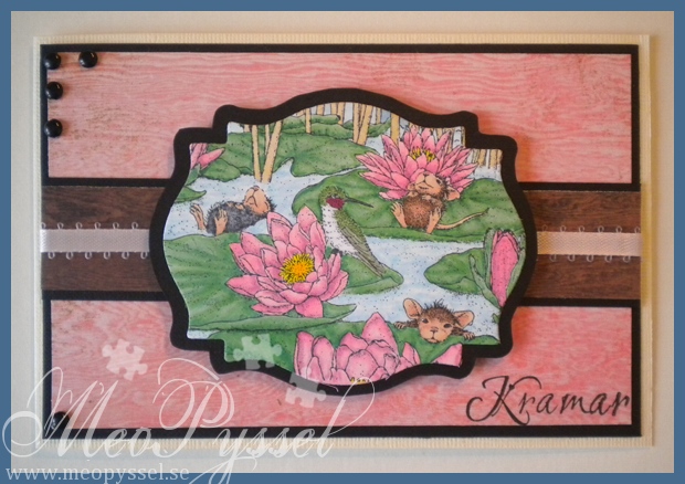
Pink Waterlilies

I have for a while now been coloring another House Mouse image for practice, and this time I used the lily Pad Pond from the Summer: Waterlily-set.

I’m really sick and can barely think straight so now when i decided i had to mount the image onto a card for this weeks House Mouse and friends challenge i really say that it turned out good, but it’s not terrible anyway.

So this will be a short one so i can get back to bed. Hope you enjoyed it anyway.

(the right side of this photo is most true to the real colors)

Copic:

  • Skin: E00, E21, E11, E13, 04
  • Hummingbird: N7, G85, YG17, C2, R39
  • Fur:R20, C8, C6, 4, E37, E35, E33
  • Waterlilies: Y08, Y17, RV34, RV23, RV21
  • water: B00, B21, 0
  • reed: E41, E43, Y21
  • sky: B41
  • greenery: G17, G14, G12

Paper: Basic Gray’s Life of the Party collection

Other: Nestabilities, brads and soft pink ribbon.

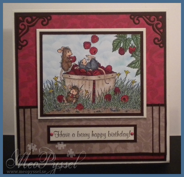
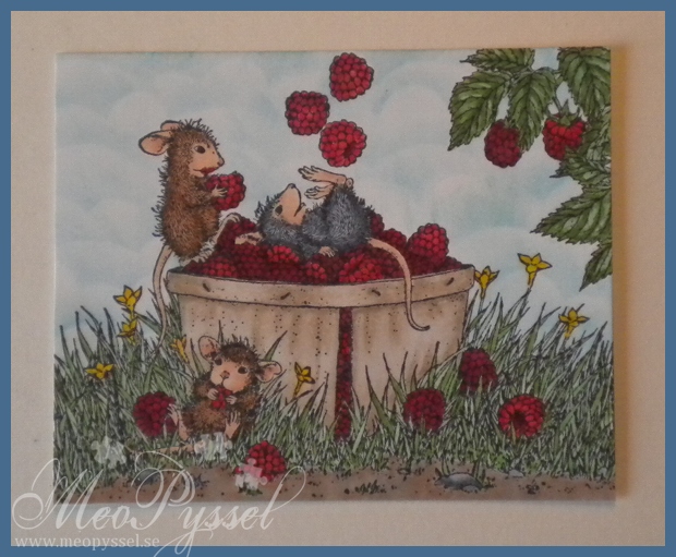
Juggling Raspberries – Finished Card

So today i did use my ”Juggling with Raspberries to make a card.

I have been watching the progress of this two-week challenge from House Mouse and Friends and i havn’t come up with a contribution until now.

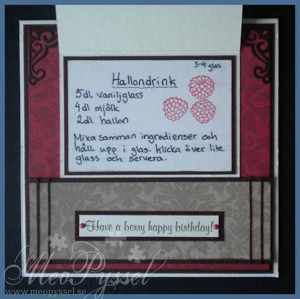
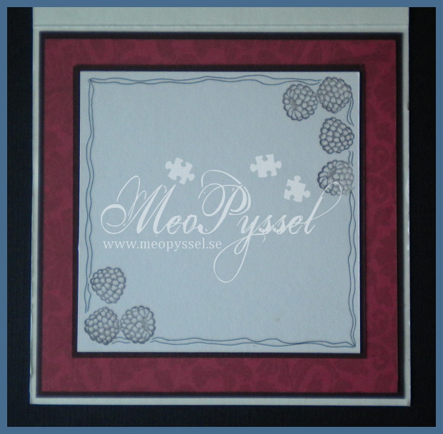
The card is featuring the House Mouse stamp Juggling with raspberries from the Summer: Waterlily-set, the same goes for the raspberries on the inside and on the recipe. The image is colored with copics and distress inks. The sentiment is from the House Mouse set Autum: Berry and is stamped with Versa Colors Pine Cone. The Papers that I used are from Inkido.

The embellishments are brads and small strips of the brown cardstock i used, and the corners are from one of the dies in Provocraft’s set Vintage.

The recipe on the fold is one for a ice cream-raspberry drink. Unfortunately i don’t have a printer for the moment so it’s my bad handwriting on display. The raspberries in the recipe is stamped with Versa colors Cardinal.

Papers: Inkido’s Martha – Croissant, Tuva- Lipstick red.

Stamps: House Mouse’s Summer Waterlily, Autumn: Berry

Copic: E40, E41, E43, R24, R29, R39, R59, G12, GG14, YG17, G12, G14, YG17, YG67, C8, C6, C4, C2, E37, E35, E33, E31, E33, E21, N1, N3, Y17, E00, E13, E11, E21, E04, Blender Pen

Inks: Broken China and Tumbled glass distress inks, Versa Color’s 171 Pine Cone and 25 Cardinal.

Other: Provocraft’s Vintage

Juggling Raspberries Part 3 – Sky

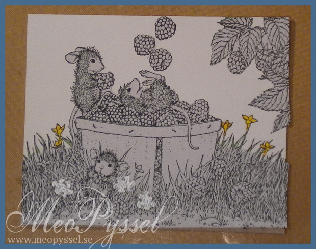
I dag var dagen då jag bestämde mig för att göra klart min ”juggling with raspberries”. Vad jag hade kvar att göra var himlen. Jag tycker det är en bra ide att göra himlen på bilder som denna då bilden annars, oavsett färgläggning, ser mycket platt ut. Jag valde att göra en molnig himmel för att skapa lite rörelse och djup.

Det första jag behövde göra var att skapa en mask så att de känsligare delarna av bilden inte skulle få en förvrängd färg av det blå. Som ni kan se på första bilden har jag inte varit hundraprocentigt noga men jag har sett till att svansar, öron, ansikten, hallon och korgen är maskad. Jag sparar alltid min masker, och jag sätter dem på insidan av CD-fodralet som jag förvarar stämpeln i så att jag alltid kan hitta dom när jag behöver dom nästa gång. Eftersom att jag ville att himlen skulle synas mellan de längsta grässtråna maskerade jag inte den delen. Jag tyckte inte heller att det skulle göra nåt om blommorna fick en lite annorlunda färg så jag klippte helt enkelt av masken en bit ner från gräset.

Molnen är skapade genom att jag använde en bit papper som jag klippt ut moln-former på och sedan distressat runt om. Jag har använt varannan rad med Broken China och varannan rad med Tumbled Grass för att få lite variation i färgerna. Sedan gick jag över allt med ett väldigt tunt lager av Tumbled glass. Jag använde hela tiden en bit avklippt smink-svamp for att kunna komma in på små utrymmen. När jag gör moln på det här sättet börjar jag alltid längst upp och går sedan neråt. När jag går ett steg nedåt förskjuter jag också mallen lite åt något håll så att det inte blir samma moln-formation under varandra. När jag lägger på färg gör jag det alltid i en uppåttgående rörelse och inte i cirklar då jag tycker att det skapar en bra skuggeffekt. Till slut tog jag av masken och duttade färg på de bitar av motivet som masken dolde, som mellan den stående musens svans och korgen.

Jag känner mig nöjd med hur himlen blev i stort sett. Tyvärr glömde jag att ta bort Broken China från svampen under en av mina omgångar med Tumbled Glass vilket skapade en mörkare bit under ett av de hängande hallonen. Men handgjort är ju handgjort så det får vara och jag hoppas att det bara är mig som det retar till vansinne…

För de som vill göra en egen moln-formad mall är mitt tipps att inte göra den symmetrisk. Jag använde från början en scalloped nestabilities-cirkel men det blev lite livlöst. Min nuvarande mall är gjord så att jag drog ett rakt streck med en linjal och sedan tog jag mina olika nestabilities, ovaler och cirklar och ritade med hjälp av deras insida olika former ovan strecket. När jag var nöjd klippte jag sedan ut den.

Stamp: House mouse’s Juggling raspberries (from the Summer: Waterlily-set)

Distress Inks: Broken China, Tumbled Glass

Other: Eclipse Masking Tape

Welcome to the world Theodor

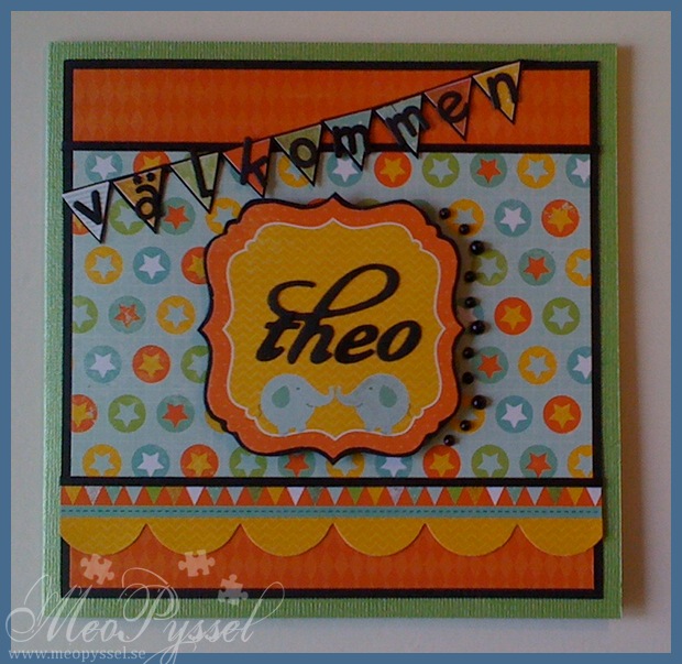
This card is a celebration for my best friends new baby boy Theodor. He was born on the 12th of august and i can’t wait to see him!

Earlier in the week is was by CiLi in Papers and bought some of the new Bo Bunny paper packs and my eyes fell on the Kaiser Kraft’s Party Animals paper pack and i couldn’t leave without it. I fell in love with the colors and that you can make any kids card with it without a problem. I have been thinking of making a card for little Theo for a while so i deiced that the Party Animal paper were perfect for it.

I used this weeks Simon Says Stamp challenge for the layout.

I used some regular black adhesive pearls for the embellishments on the right side of the focal and some glitter pen on some on the banners, one of the elephants and some of the small banners on the border. The banner with holds the sentiment ”välkommen” (welcome in Swedish) is made by cutting out some small banners on a banner-paper in the collection and then gluing it on a black mat and adding the letters. The letters used in the banner is from Provocraft’s Baby face alphabet and the letters on the focal is from Quickutz’s Harvest alphabet. The backing on the ”Theo” is from the die-cut-sheet and it’s backed on black as well.

There is only a photo of the front today when my camera have gone into hiding and i can’t find it anywhere so this picture is taking with my phone.

papers: Kaiser Kraft’s Party Animals

dies: Provocraft’s Baby face alphabet and Quickutz harvest alphabet

Fruity fun on Hello Luscious

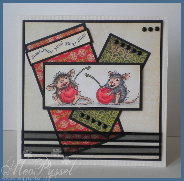
Ever sense i made the grayish card with these two wonderful mice I have wanted to do one in color, but i have been a bit intimidated by the red blending. After seeing all the food and fruit-challenges this week i decided to give it a try. I think i was very successful with the cherries. I did keep them a bit light, mostly so i could start training on that colors before i gave it a try with a darker shade.

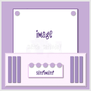
I used this weeks Sketch Saturday layout for the card and i REALLY hope i win due to the fact that the prize is copic-pens. And i want and need more of them!

All the bright edges, like the image and the beige papers have been distressed with Antique Linen. The sentiment is from The Basic Grey’s Cup of Tea stamp-set. The inside is very simple but I think it matches the clean-looking front.

Copic: E00, E11, E13, E04, N5, N3, N1, R20, R22, R24, R29, G17, G67, E39, E35, E31

Paper: Basic Grey’s Hello Luscious and Basic

Stamps: House Mouse’s Fruity Fun and the feet from the clearstamp Halloween-set, Basic Gray’s Cup of Tea

Other: Antique Linen Distress Ink

1000 sheets blog candy

Amy is haveing a huge blogcandy giveaway on her blog and I so want some. Both because it’s wonderful papers but also for the fact that some of my favorite Sweet November stamps is included and i want them! To see the post click here. Now it’s only to keep my fingers crossed!

Twincards with Origins

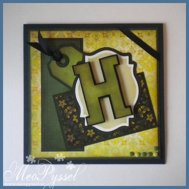
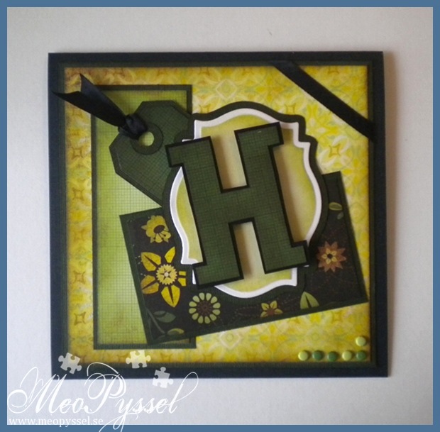
This weekend my twin cousins will get confirmed so i have made a card for them to go along with the gift. Sense they are twins I deiced to use the same layout and the same paper but switch among the patterned papers. I have troed to ge a more maskuline and rough clean stile if that makes sence.

Because it’s summer (and the fact that i got it home yesterday) i deiced to use Basic Greys collection Origins. I have used papers from the 6×6″ paperpack and some single 12″ papers. I have tried to have one brighter and one darker card.

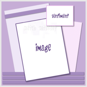
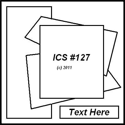
The layout is from this weeks Inspirational Card Sketches, a bit modified but i hope everyone can see the similarities anyway.

The H’s are for their names (Henrik and Harald) and I made them by drawing a template that i then traced four times. On the ones with the patterned paper i then cut away a small portion on all sides. The frame for the H is made with Spellbinders label 18. The tag is made with Tim Holtz’s die Tiny tabs and tags. The ribbon used for the tag and for the corner is a regular satin black ribbon. The dots in the lower corner is just some different colored brads.

All the papers and the frames have been distressed with distress inks. All the papers have been distressed with Peeled Paint and a little bit of Vintage Photo. The frames have been distressed with Shabby Shutters and a little bit of Peeled Paint.

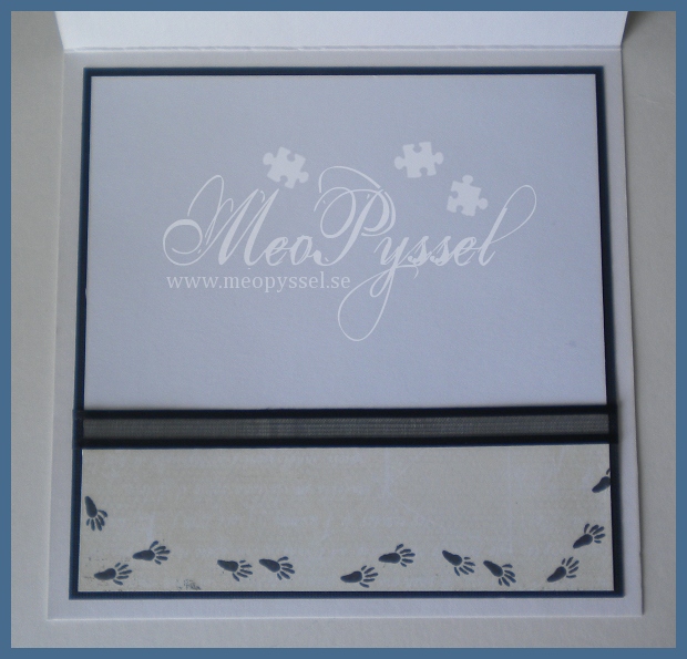
The insides are also copies of each other and are only different by the paper that is used on the bottom. The chosen  paper is the same as the on the from so there is a connection between the two pages. You can see the insides here and here. I left a lot of white space so all the families signature will fit;).

Paper: Basic Grey’s collection Origins

Dies: Tim Holtz’s Tiny tabs and tags, Spellbinder’s label 18.

Other: Peeled Paint, Vintage Photo and Shabby Shutters Distress Inks.

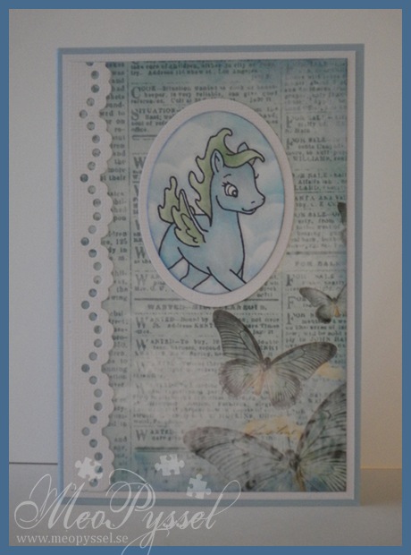
Heavenly Breezy

Copic: N1, N3, 0, G12, B00

Stamp: Sweet November’s Breezy

Paper: Inkido’s turquoise Newspaper

Dies: Nellie Snellen’s lacy Border, Spellbinder’s Oval (large and small)

Other: Faded Jeans and Tumbled glass distress ink

Summer Hello Luscious

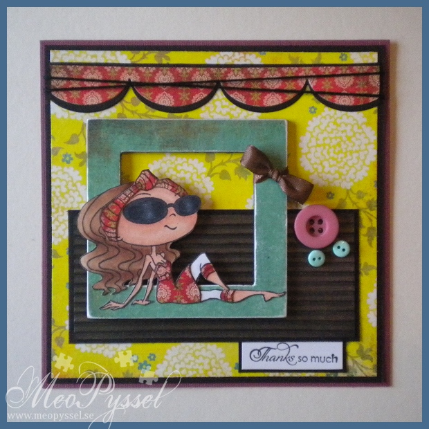
I’m just so stupid, i have been doing this card all evening with the thought that the Kraftin’ Kimmie recipe was: a bow, a button and a chipboard. Sigh. Well fortunate i seem to have everything everyday if you count the flowers on the paper, which i do.

Well anyway… The card is made based on Basic Gray’s collection Hello Luscious and both paper and buttons are from that collection. To get some dimension i did run the brown paper through my paper crimper and i used a piece of thick chipboard that i glued the blueish paper to. I did sand the paper on the chipboard to get the white of the paper and the chipboard to blend together. The sides, on the outside and on the inside is painted black with a magic marker just so the gray won’t show.

The stamp that is used is Kraftin’ Kimmie’s Florence and the sentiment is from Gina K’s Fanciful Tags. I did paper pieced Florence dress with the same paper I used in the top border. Otherwise she is colored and shadowed with copics. I’m not happy with the lower part of the face. Stupidly enough i did the glasses last so i spilled some black onto the face and when i tried to save it the colors got separated and bad, and it felt like it got worse the more i tried to save it so i gave up.

The black twine and the brown ribbon is some generic kind that i just had laying around. It was the same with the chipboard, i got it in a free sample pack a long time ago and i don’t remember from were i got it.

The colors of the card ain’t that true in this picture. It’s stormy outside so i had a hard time to get a good light to take the picture in so the colors are a bit brighter then in real life. The card also look very much more dimensional then on the picture, it might be the colors that makes it look flat but i also had to take the photo of the card laying down which probably doesn’t help…

An inside will probably come tomorrow, I’m just to tired now and will get something to eat…

Copic: E00, E11, E13, E39, E35, Y21, 0, C0, C2, C10, C8, C6

Stamps: Kraftin’ Kimmie’s Florence, Gina K.’s Fanciful tags

Paper: Basic Gray’s Hello Luscious

Other: Basic Gray’s Hello Luscious Buttons, MFT’s Jumbo scallop border die, Paper Crimper


I got my Mojo back

I think i have my mojo back! For the last couple of days i think that everything i do gets OK or worse but today I’m so happy with my card! I really think it’s a success and i really think it’s well balanced! I got my Mojo back, and with a MOJO sketch- how fun isn’t that? 🙂

This card is for my dear brother. His birthday was for a few month ago but we haven’t seen each other so i haven’t hurried with the card until now (we will meet this weekend). So a bit late, maybe, bu Happy brithday Oskar!

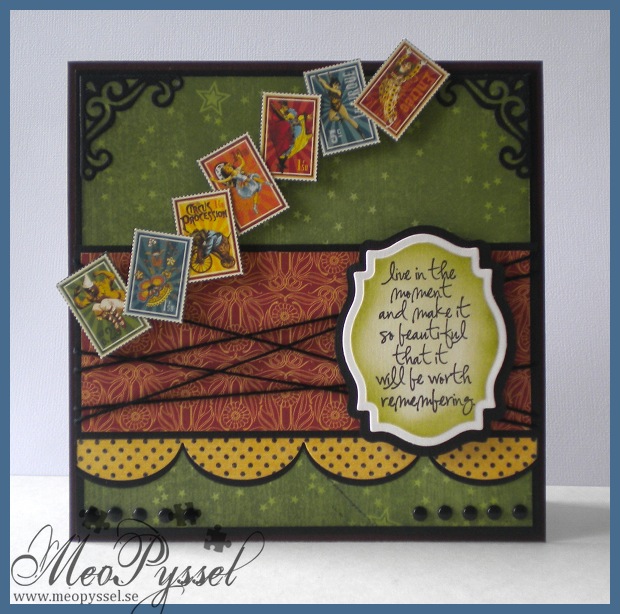
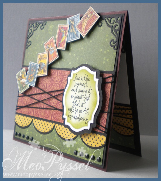
I did choose the colors by that fact that my dear brother told me he liked dark red and green and gray colors with a bit of old texture. I didn’t fin and burgundy or grays but i really like this green paper from Grapic45’s collection Le Cirque so i kept going from that one. All the papers i used if from the same collection. The stamps or circus-pictures that i used across the card is also from the same collection and i simple cut them out and put them up on foamdots.

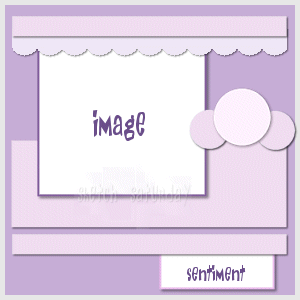
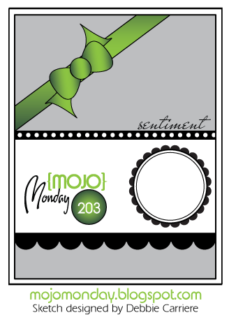
I did use this weeks MOJO Monday sketch for my layout. The focal-point is a Tim Holtz sentiment from the set Urban Chic. I actually started out with the sentiment, that i really is suitable for my brother when he really is out there living his life. I was after i had the sentiment i wanted the circus-stamps. I think it work very well together and i hope my brother will understand the connection and that I’m just amazed over his lifestyle. Anyway… i did frame the sentiment with my new favorite Nestabilitie, the label 18. I cut it out with one of the smaller dies and the traced around the outside of the die on a black paper to get a smaller frame to back it to then i would have got if I used the bigger die for the frame. That is one thing i dislike with the labels, that it’s a big difference between the dies but as long it can be traced around I’m not gonna be to noisy about it.

The green paper and the sentiment have been distressed with Peeled Paint and all the other papers have been with distressed with Antique Linen. The scalloped border is made by my new (and i think it will be an favorite) MFT’s Jumbo scalloped border. I did cut it twice, once in the dotted paper and once in the black so i could the a nice definition against the other papers. The other embellishments are the already mentioned stamps and some regular black brads and some black twine. I did embellish the corners with one of the corner-dies in the vintage die-set.  I so love the contrasts in the card, brought fourth by the black details.

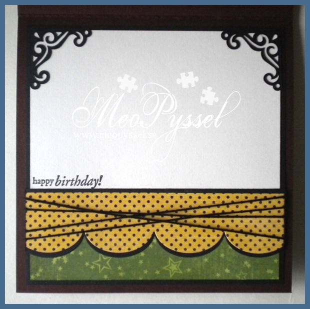
I tried to keep the same layout for the bottom of the inside with a feel smal changes, of course, to give space for the written greeting. The stamp that is used is from Penny Black’s clearstamp-set Critter Party.

Papers: Grapic 45’s collection Le Cirque

Stamp: Tim Holtz’s Urban Chic, Penny Black’s Critter Party

Dies: Spellbinder’s Label 18, MFT’s jumbo scallop border

Other: Peeled Paint and Antique Linen Distress Inks.

Mojo Monday – layout

A Spoon Full of Sugar – #162 Happy Birthday