Etikett: Spellbinders

Girly But no Pink Allowed

So here comes my first contribution as the DT member for Sweet Stampin’. The theme for this weeks challenge is Girly but no pink allowed.

Our sponsors for this week are Pollycraft which will give a lucky winner 5 digis.

We also have our Monthly sponsor Joanna Sheen that will give a £10 gift voucher.

—————————————————————————————————————————————————–
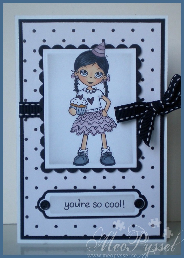
So onto my card; I usually don’t use Pink but just because of the challenge everywhere I look in my stash i see pink, and i have to admit that I have been very nervous to make this card and post so the process of this card have been a very hard one.So I got this lovely digi from Pollycraft called Cupcake Party and are featuring Celeste Amberglow. I don’t have a printer at home because it broke down like two (or more?) years ago so I normally print at a friends or my moms house. I think the nervousness got the better of me because the first print I didn’t bring copic-paper, the second one I destroyed when i was fussy-cutting and the third one I mangled in my cuttlebug… so after those sad attempt i deiced to make a serious run so I printed the dear Celeste like 10 times so I wouldn’t have to run over to our friend again and at the same time giving me some room for more mistakes (which of course i didn’t do now when i had the materials for it).

First when i saw this image I really wanted to make a bright and happy card so I found my Bo Bunny Peacock Lane collection and started to color. I have to admit that The card was far to dark and everything just looked a bit off so I had to start over. Luckily for me a new flash of inspiration came this Tuesday when my big order from the USA came. I had ordered a lot of new copics and several nice dies so I decided to us as much new things as possible. The new pens I got were from the 90-seriers so I went for the V90’s for the color-scheme on Celeste. I know that it’s dangerously close to pink but it’s purple so I think I can get away with it. To really bring out this dusty purple i deiced to go for all black and white on the card so all the other coloring (except the skin) is made with the cool grays.

I framed Celeste on my new Spellbinders Large Rectangles and Large Scalloped Rectangles and distressed the edged a bit with Weathered Wood. I then put my sentiment (which is a a tired minds wordplay on the cool grays I used and a nice sentiment for a young girls birthday) on the shapabilities double ended tags. Sense it’s a 10x15cm card I didn’t decorate it much but i did use soem brads and I ribbon just to give it something more. The sentiment is from Lawn Fawn’s Critters in the snow stampset and I stamped it with Archival Brilliance Graphite Black.

Stamp: Pollycraft – Celeste Amberglow – Cupcake party. Lawn Fawn – Critters in the snow

Copic: E51, E21, E11, E93, 0, B91, B93, V91, V93, V95, V99, E35, YR23, C0, C2, C4, C6, C8, C10

Dies: Spellbinders – Nestabilities – Large Rectangles, Large Scalloped Rectangles. Spellbinders – Shapeabilities – Doubled ended tags.

Inks: Memento – Tuxedo Black. Distress Ink – Weathered Wood. Archival – Brilliance – Graphite Black.

Soft Peachy Tilda

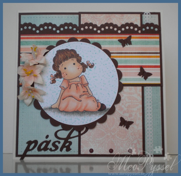
 Last week I decided to practice coloring fold, simple folds, and i choose this nice Sweetie Tilda from Magnolia to practice on. I have also for a long time been wanting to use my YR00-YR02 for this nice peach-color so I got on with it and this is the result. I’m really happy with the bottom-part of the dress and the hair but I should had made the belly-area a bit darker, but that will have to be for the next time.

After little Tilda’s dress was done I went looking for papers that would fit and I found this collection from Bo Bunny called Kitchen Spice. I think these papers are just beautiful with it soft and at the same time vibrant tones. I tried to match the hair and shoes to the paper and then making a dotted background (that I went a bit overboard with) to match.

As I’m not use to working with light colors like this I decided to try to use some flowers to get a easter/spring-feeling. And for being to things I’m not that comfortable with I’m very happy with how the card turned out. I have to admit that i just couldn’t chose a lighter cardstock, i still needed contrast but i still think it feels bright and light. I have no idea what brand the flowers are but i bought them in the Magnolia-shop in Borås like a year ago i think. I really like their color and shape.

The greeting ”påsk” means Eater in Swedish and I intend this card to be an easter-greeting for one of my grandparents, I haven’t decided which ones yet. I’m not that into the whole Bunny-themed easter so this card is more of how i view eater, spring but still a bit chilly:). The letters i used is from Quickutz alphabet Harvest, which I love the look of. But i do hate the die (in my cuttlebug that is)… I never get it to cut everything so i always have to go over it with my knife. And i have tried like dozens of was to sandwich and fill out with cardstock but nothing works. If anyone has a tip I’d LOVE to hear it! I would like to use this die more often…

Stamp: Magnolia – Sweetie Tilda

Copic: YR02, YR01, YR00, YR000, E49, E29, E93, E11, E21, E51, E29, E39, E35, YR23

Paper: Bo Bunny – Kitchen Spice

Dies/punches: Spellbinders – Nestabilities – scalloped and normal circle. Nellie Snellen – Borders. Artemio – Butterfly 3 (small). Quickutz – Harvest Alphabet.

Other: Sakura – Gelly Roll – white

Table-placements

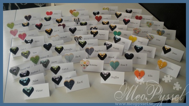
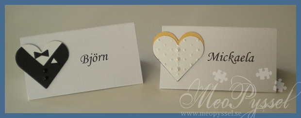
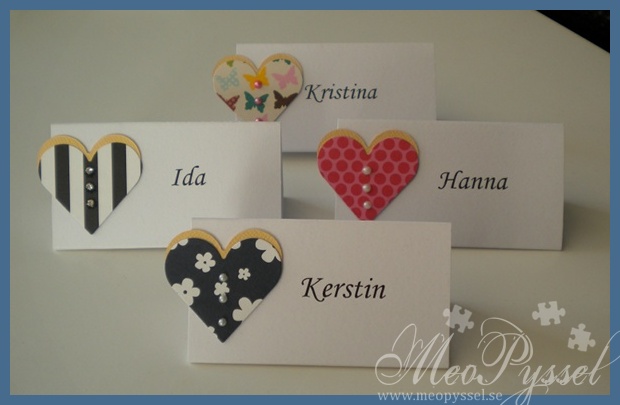
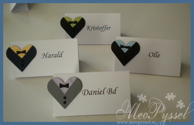
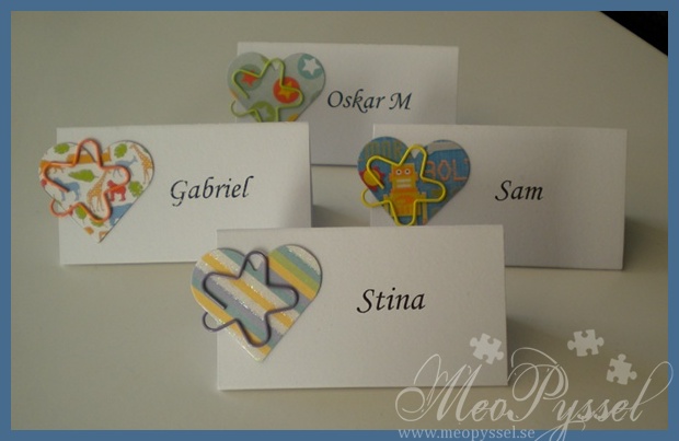
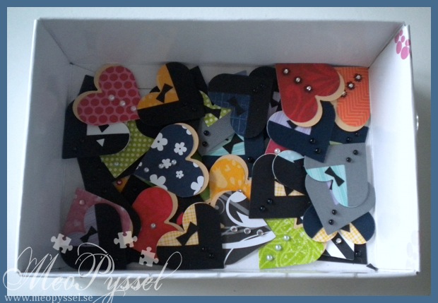
So i have finally finishes all the table-placements (which i did like two weeks ago), photographed them and now actually posting them. So here comes a group photo and some samples of the three kinds I made.

All the hearts is made with Spellbinders heart dies and I did use the second smallest one. The dresses are made with a skin-colored heart and a patterned paper heart a bit off-set to get a dress and neck-line. The jackets are made with a colored heart for a shirt and a black, gray or dark blue one that i cut out a triangle to form the jacket, there can be duplicates among the mens costumes. The kids hearts i simply a single heart with a flower-shaped paper-clip.For all the backsides i also attached a black heart so the person on the opposite of the table don’t need to see a ugly back of the hearts.

The white base is made from a white 225g smooth white cardstock measuring 8x12cm. I scored the paper at 1, 5,5 and 9 and then cut folded it as a triangle with a 1cm flap to keep it all together.

I’mreally pleased how they all turned out and I just can’t wait to see them all one the tables on the wedding!

I of coarse have to start off with the ones for me and Björn. The dress that is for me a copy of the ones on the invitations but a size smaller. On Björn’s jacket i did make a pocket to get his jacket to be a bit different from the others (It was actually Björn’s idea). Björn is also the only one that has a white shirt.

When it comes to the womens dresses I have tried to keep the colors and pattern to what color the person do like and on the ones I didn’t know I have either tried to imagine them In this kind of color or I took one I liked.

As I did say the mens hearts are made up with a few different colors and patterns on the shirt and black, gray or dark blue for the jackets. There might be some duplicates but it’s more like to be like that at the wedding anyway.For the kids I deliberatively tried to take bright and fun colors and patterns due to the fact that I think they will see them as more fun then. I also gave them all a paper-clip that is removable so the bigger kids can play with.

Purple Kitty Katastrophe

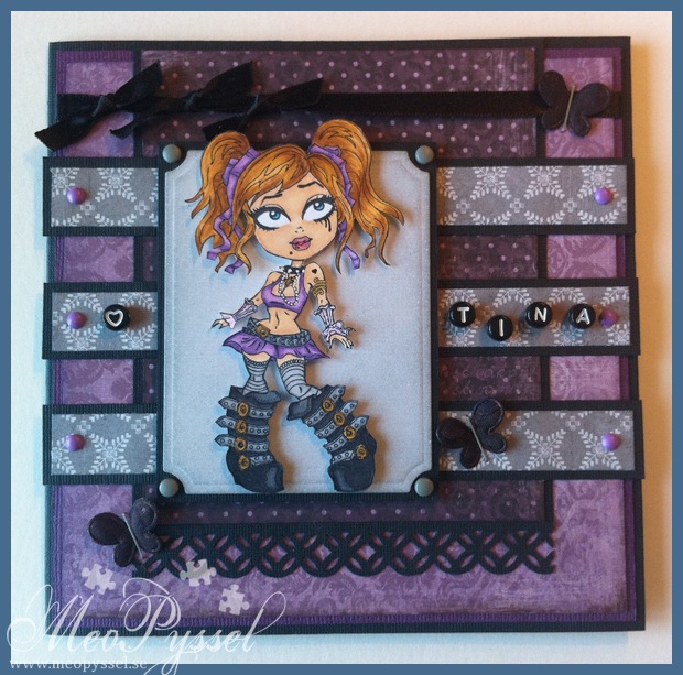
This Tuesday it’s my baby-sisters birthday and i have been working on this card for quite a while now. I started to colors this like months ago in this nice purple tone. I recently found it just laying around so I deiced to make i for my sister, it’s a very fitting color and image for her. So I did the last coloring, like the hair, to suit my sister even better. The haircolor I chose I one that i think mimics the color my sister have right now. The frame for Kitty is made with nestabilities small labels and i started out with a white paper and then distressed with weathered wood. I do now own this stamp, I stamped up a couple on my copic-course in September so I have two left I think.

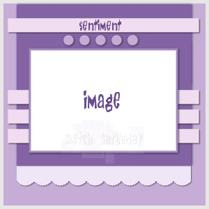
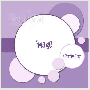
Anyway, i did use this weeks Sketch Saturday-sketch for my layout and i tried to keep with the purple tones from the coloring. The purple papers are from Maja Design’s collection ”Ska vi ta en fika?” and the gray paper is from the Little black dress collection. All the papers have been distressed with either Dust Concord or Weathered Wood.

The top embellishment is a black satin ribbon that i tied some knots and the bottom one is a border made with Martha Stewart’s borderpunch Modern Garland. The butterflies are some fabric butterflies in pink and blue that I made black with a permanent marker and just stapled on. They have a bit of the shimmer of the old color which gives them a nice depth. The greeting is using some alphabet-pearls from Panduro that i glued in place with some glossy accent.

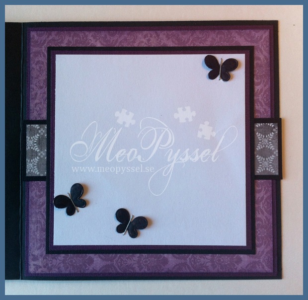
The inside is made with the same paper and idea as the outside and I left a nice big space for the greeting.

Stamp: Kenny K – Kitty Katastrophe

Paper: Maja Design’s -Ska vi ta en fika?, Basic Gray – Little Black Dress

Copic: V17, V15, V12, V000, E51, E21, E11, R22, E35, RY20, YR21, YR23, Y19, Y17, N9, N7, N5, 0, N3, N1

Other: Gelly Roll pen – White, Gold. Distress Ink – Dusty Concord, Weathered Wood. Martha Stewart  – Modern Garland. Spellbinders – nestabilities- small labels.

Sneak Peak of Table-placements for my wedding

And the second reason for me not posting for a while is that I have been preparing to make my table-placements for my wedding. On Wednesday every should have left a response so I should be able to finish them.

I wanted the placements to have a connection to the invitations (you can find them here) so the thought is that they are based on the heart-dress or heart-jacket. But to get a more fun and relaxed feeling I have used lots of colors. All the dresses or made from different papers and I have tried to connect specific people to specific colors and patterns. I only used papers from my little scrap-box and i found it a nice way to get a bit fewer scraps. For the men i changed up the color of the jackets and that are in either black, navy or gray (not so many gray due to the fact that i didn’t have much scraps of gray). I also changed up the color of the shirts for the men, always using papers of some kind of texture. The mens shirts are not unique and there is a couple of ones that are the same.

I have made a document with the names so tomorrow I will buy myself some nice medium/heavy-weight paper and then print them. Hopefully I will also have time to assembly them tomorrow but we will have to see… But until then here comes a sneak peak.

Marine birdy

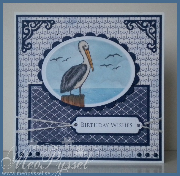
So tonight i wanted to make a card for my mother in laws boyfriend. His birthday is in a couple og week, but he gave me the perfect reason to use my new stampset By the sea from Gina K and this beutiful papers for Maja Design.

I Wanted to make a scene for this card, i have been very inspired by Theresa Momber and her scenes lately and i just have to get some more sets to make better and more naturescenes.

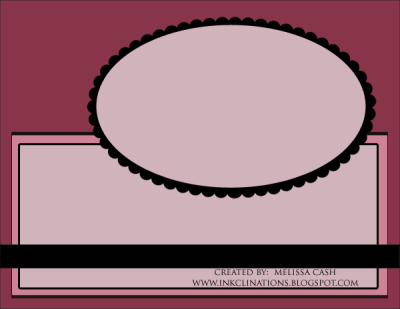
Anyway. This card is made with the though of Gothenburg’s seaside, and thats why I bought this papers from the beginning. The layout is from this weeks Gina K challenge.

I have to admitt that im not happy with the sky at all. The darker part is made with faded jeans but on the sky it only came of as gray wish made my spring sky to a bit more stormy but it will have to be for this time. I do like the sea but next time i think i will make a less straight horizon.

20/3-2012
I just saw that i won Anything goes challenge for this week. I’m just bubbling of happiness!

Paper: Maja Design – Life by the sea

Stamp: Gina K – By the sea, Garden Silhouette

Copic: YR14, YR23, YR21, B93, E40, E43, N9, N7, N5, N3, E35, E57, 0

Ink: Distress Ink – Faded Jeans, Tumbled Glass, Memento – Tuxedo Black

Dies: Spellbinders – oval and scalloped oval, . Provocraft – Vintage

Other: Gelly Roll Pen – White

A Brown Forestdragon

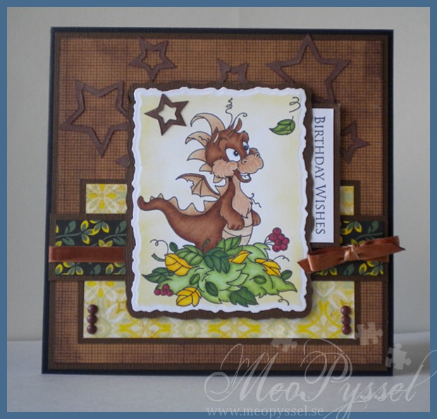
So this weekend is my dear friend Martin’s birthday so i wanted to make him a card. He, as I, love dragons and this cute one landed in my mailbox a week or so ago. His name is Autumn Happiness and are from Wee stamps.

The dragon is as usual colored with copics and i cut him out using the Large deckled rectangles nestabilities. I didn’t want to make him the regular green dragon but i still wanted to get him a feeling of wood and nature sense that is what Martin is all about, so he became brown. I inked the inside lightly with the Dandelion memento ink. I backed him onto some Basic Gray paper, from the Origins collection. The sentiment is from Gina K’s Garden Silhouettes. The ribbon I used was from the beginning a white satin-ribbon but i colored it with E37 to make it match the dragon. The stars I used are from a die-cut-sheet and i cut them out and colored the white backside with the Rich Cocoa memento ink. All the edged have been inked with memento to make the transition smoother.

26/2-2012
I Just saw that this card was the spotlight card for Secret Crafter Saturday Challenge this week! I’m just so happy!


Stamp: Wee stamps – Autumn Happiness. Gina K – Garden Silhouettes

Copic: E31, E33, E35, E37, B93, YG17, YG13, YG11, YG67, G29, Y17, Y15, Y13, R39, R59

Paper: Basic Gray – Origins

Ink: Memento – Dandelion, Cottage Ivy, Rich Cocoa

Other: Spellbinders – nestabilities – Deckled Rectangles Large

A clean and simple purple heart

So when i finish the House Mouse-card I still had some time over and i wanted to make a card for my dear friend that i feeling a bit down now so I want to cheer her up in the only way i can.

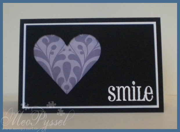
A week or two ago i saw this card on the Casual Friday Challenge and i just love it so I wanted to make a clone. Yes i have started to clone cards, I’m trying to expand my style a bit and I think this help with widening my horizons.

Anyway, my friends favorite color is purple so I wanted to incorporate it into the card. I started out with the same idea but with purple and white, or purple and black cardstock but it just didn’t look good so i went back to original card and used a black and white cardstock and only having some purple in the heart. The purple paper is from Kaiser Craft and the Sentiment is from AmyR’s Big Words and it’s embossed with White embossingpowder. I have to get me some ultrafine embossingpowder. The top layer, the black one with the heart-window is pop up on some dimensionals.

Dies: Spellbinders – nestabilities – Classic Hearts

Stamp: AmyR Sentiments – Big Words & Handy Additions

Paper: Kaiser Craft

Maskuline Party-mouse

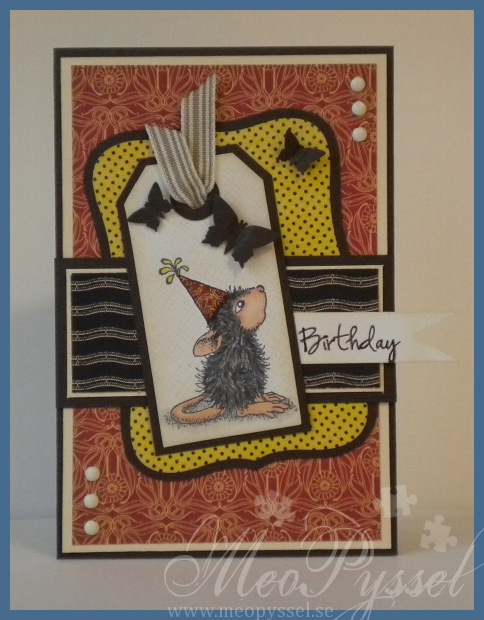
 So yesterday i sat down to make a card for my friend’s birthday tomorrow. I wanted to use for of my Graphic45 papers when i think they work really good for a man so i choose some papers from the Le Cirque-collection.

The mouse is stamped on a tag created by using Tim Holtz’s Tiny Tabs and tags. I did color him with my copics and the paper-pieced the hat with the paper i used for the background. After tat i masked the mouse of and distressed the tag with Antique Linen, after that i stamped it with Hero Arts’ background stamp Envelope Pattern to get some texture. Unfortunate i made a bit of a stamping-mistake on the upper right corner so I did cover it with a Butterfly.

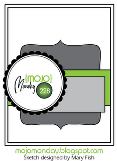
The layout is made by using this weeks Mojo Monday. The sentiment is from AmyR Sentiments and I made the banner by just cutting the edge and distressing it with more Antique Linen. First I stamped the Birthday with Memento’s Rich Cocoa, but it looked a bit to pale so i traced over it with a black pen.

Stamp: House Mouse – Birthday – Ice Cream. Hero Arts – Envelope Pattern

Copic: E13, E11, E51, E04, Y15, W5, W7, W9, 0, W3, W1

Paper: Graphic45 – Le Cirque

Other: Spellbinders – nestabilities – Labels 8. Tim Holtz – Alterations – Tiny Tabs & Tags. Butterfly-punches.

Ink: Memento – Tuxedo Ink and Rich Cocoa. Distress Ink – Antique Linen.

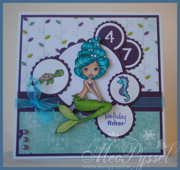
Mom’s Birthday-mermaid

 So last weekend was my mother’s birthday but i hadn’t had time to make her a card so i have spent a bit of this week (coloring and cutting) and weekend.

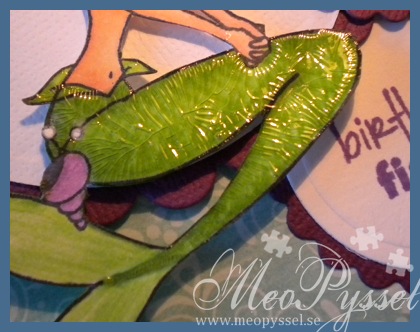
As it was for my mother i just had to use a mermaid or some fishes, so i choose my favorite mermaid, the Sweet November Bubbles Lostlagoon. Both me and my mom really love the blue/green color, she more for the mint green and me more for the petrol, so I decided to use Bo Bunny’s collection Peacock Lane. I tried to color Bubbles accordingly to the papers. I used BG45 and BG49 for the hair and i have to say that i love these pens, the blend so nice and give a such nice vibrant color – I need to use them more often from now one. The pearls in her hair have been colored with a white gelly roll-pen. On the tail I used like the only combination of yellow/green that i have but i didn’t feel happy with it so i tried to give it a bit more texture by making a crisscross-pattern. But I still didn’t like it, it looked to dull so i covered the tail with some crackle accent. To make Bubbles company i stamped and colored Seamoore and Lio that are companions for some of the other mermaid but i thought that this would be perfect for my mother.

For the sentiment I used AmyR’s underwater sentiment stamped with some Grape Gelly Memento Ink. The 47 is made with the smallest scalloped  and normal nestabilities circle and the Provocraft’s alphabet Babyface. The ribbon is tied with a Nellie-knot, I saw Heather making on on a video, you can find it here, and I just loved it. I have always had a problem with using sheer ribbon due to the fact that i don’t like the adhesive showing through and i want the ribbon to be at least a bit fastened- so this was a great solution, and it worked out great for this card!

Lastly i hope my mother can forgive me for putting her age on her card:D

Stamp: CC Design – Sweet November Mermaids – Bubbles Lostlagoon, Seamoore, Lio. CC Design – AmyR Sentiments – Underwater sentiments

Copic: E11, E21, E51, R22, BG49, BG45, BG11, YG17, YG13, YG11, V17, V15, V12, 0, E31, E33

Papers: Bo Bunny – Peacock Lane

Dies: Spellbinders – Nestabilities – Large and Small Scalloped Circles and Circles. Provocraft – Babyface

Other: Memento – Grape Gelly. Gelly Roll pen – White.